This is my evaluation for my Media AS Coursework. As you can see, it doesn't look too creative however I did try my best and I explained everything I needed to when presenting. I spoke about all the choices I made and explained them. I didn't put up every piece of information one each slide because I felt it would look too squashed together, cluttered or overall just too much writing to read. So I only put up a little bit, but talked about it a lot. One thing I included which we weren't asked to was how I would promote my magazine, and I spoke about different methods of marketing such as viral marketing and SMO (social media optimization) marketing. If I was to do it again, I would make my presentation look better and refer to my preliminary task a bit more, maybe add more content to fill in blank spaces and include my own reader profile.
I decided to adjust the lighting of the image by brightening/darkening it. I am please with the way it looks and I think it is something that would be featured within a music magazine. The picture illustrates summer a bit more and because it's for my fashion spread, it shows that there are two different sides.
I decided to take a picture for my contents which would reflect the Summer and also be for the 'styles and trends' page. This sort of spread is featured in most music magazines. My model is looking to her left and the sun is shining on her left, leaving the rest of her dark, which creates a good effect. I saturated the image, and made the shaddowed side darker and the light side brighter. It may need further edits, but overall I am happy with the way it looks.
After doing my draft contents page, I realised that although the second image was edited, it still looked quite plain. But, if too much was done to it, it would look tacky. So I decided to add a black outline and a few splodges to make the image look contemporary and overall interesting to look at. I also altered the saturation of the image. Instead of writing the caption in the bottom right corner, I decided to place a speech bubble in the right corner with the caption, which makes it stand out more and look quite humourous. The speech bubble is purple to go with the title, so it doesn't look like it is the only purple thing on the page. I am pleased with this edit because it images the model/featured artists age and personality. I will use this for my final interview page.
This is the draft for my interview page. I decided to use two images to make the double-page spread look more interesting to look at, and to also show two different sides of the featured artist. The colour scheme of this page is not the same as the front cover or contents page. I did this because I thought if I made the background black and used the same font colours and everything else it would look too boring and repetitive, which I don't want. Many magazines do this. I used the same font for the actual interview but a different one for the title. I did this to reflect the featured artists appearance, which is quite 'girly'. I thought this would be appropiate as I am targetting girls. I used black for the writing because it stands out against white very well, and turqoise because it matches the model/featured artist's top and compliments the black writing. I used purple for the title to compliment the turqoise, and I think it does a good job of it. I used the same red font for the page number and magazine name at the bottom because that should always be consistent throughout a magazine. I used a funny caption for the second image to appeal to my target audience. Overall, I am pleased with the outcome of this. However, I will make further edits to it to improve it.
This is the draft for my contents page. I like it because it looks realistic and unique. I used the image on the front cover for this page and made it smaller to link it back and this makes it look like they are both of the same magazine. It also shows that is a special feature in the magazine, as it is 8 pages. Although my magazine is a music magazine, many music magazines have a fashion section, and according to my research my target audience enjoy reading magazines that do as such, such as RWD. I decided to write an editor's letter because this is featured in some contents pages, and they are always interesting to read because readers are rarely aware of who the editor of the magazine is and what they're like. I also used the same font for the title as the title on my front cover, and the same font for the features on the front cover and the editor's letter and list of content on my contents page. This is necessary because if I used different fonts for everything, it would look unusual and not realistic. I used red, blue and white for the same reasons I did for the front cover. The list of content is horizontal because according to my research magazines that have their list of content horizontally look better because this is not the case with all magazines. However, I may decide to change this for my final contents page. I have a page number at the bottom with the magazines name so that readers can refer back to the page and know what magazine they are reading throughout.
This is the draft of my front cover, which I am quite happy with. I used magazines such as bold/large title, issue date, price, barcode, features, a competition, catchy headlines and a main image. If I didn't use these conventions, the front cover wouldn't look like a front cover. I decided to use a red title because red stands out from black, and I used white writing for the features because it contrasts black and compliments red. I used blue for the two numbers and banner at the top to compliment the red title and the names of artists also in red. The features on the right are right justified so that they are facing the middle which makes the model on the page stand out, and it also looks quite neat. I like the cover because it looks like how most magazine covers do, however I may make further edits to it to make it more realistic.
Not much has been done to the image, except for cropping it to remove the excess bricks in the background. Now, the model doesn't look so small and she is the main focus of the image. The bricks give the image a natural feel, and make it look as if the featured artist hasn't quite launched her career so it isn't taken in a state-of-the-art studio.
I took this picture to allow my target audience get a slender insight of the featured artist's personality. Her grin looks quite cheeky, and looking in the opposite direction makes her look as if she has done something naughty - like a child. Her somewhat shrug in her pose emphasises this. I edited the picture and made it brighter, and made her hair look slightly burgundy to compliment her top. I am satisfied with this image, however attention is immediately drawn to the bricks in the background, and they make the model look small.
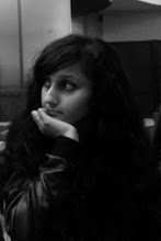
This image doesn't look too different to the other one, but I decided to alter the colours slightly because my front cover shot is predominantly black, so I didn't want this to be black too. I decided to lighten the image, so the black and white effect looks like a dark shade of brown, which looks intriguing because the iris and sclera in both of her eyes stand out more and it emphasises on the point I made in the previous post about the model/featured artist.
I took a picture for my interview page using another model. Because the artist is up and coming, I decided to use a close up shot of her face to show my target audience that she is new and her face may need familiarising with. I used a black and white effect to take the image. This gives the model/featured artist an old fashioned look, because her music is contemporary but includes soulful elements to give it a classic feel. I thought it would be important to convey this through the image taken. I made sure that the model's hair looked big to match her voice, and that her make up stood out but not too much because this could look a bit daunting. I was inspired to create this type of look by researching images of Amy Winehouse, even though her music is quite jazzy.
After a lot of frustration and lack of ideas for what to do with my image, I decided to retake my images because the model's dark clothes would blend into the dark background, and look odd on a light background. However, this would have been a long process and the main problem was the background rather than the model; the model is exactly how I want her to be.
Because I was happy with the colour levels in the first edit and the black background in the second edit, I decided to put the two together. It looks plain, but after adding features onto it and various conventions of a magazine, it won't look so boring.
The concept of this image seemed a good idea when I thought about it, however it was a complete disappointment. I cropped out the model's legs, so this made the main focus her face and body, which looks quite provactive. This is common in R&B magazines. Cropping the image ruined the whole concept of it, which was to show the whole of the model to look dominant and show her confidence. After cropping the image it becomes landscape, so it has to be stretched which makes it pixelated - not a pretty sight. However, I made the background black which I am happy with.
I used Adobe Photoshop to edit the picture for my front cover. I wasn't sure what to do, but what I did know was that I wanted to alter the dullness of the image by adjusting the brightness and colour, airbrush it, and other ideas. So that is exactly what I did. I am happy with how it turned out, however the background looks to bright, especially the flash of the camera (which was difficult to remove) and attention is drawn to that rather than the model.
This is the picture that I took for the front cover of Falsetto. The model is dressed in a casual but stylish manner. As she is within my target audience age range, I thought it would be appropiate to photograph her to appeal to my target audience. The picture has not been edited yet. The model is pushing her chest out, one hand is resting on her hip and her other arm is resting by her side, her mouth is slightly open and she is standing slightly to the side to push her hip out which shows that she has confidence and stands out from the crowd. These are the types of images usually found in R&B magazines.
My magazine is titled 'Falsetto'. Some may think this is a reference to only male singers or Opera, but falsetto is the vocal register occupying the frequency range just above the modal voice. Not many musicians can reach this vocal register. Not many people will associate falsetto with R&B.But, it is used by Philip Bailey and Ronald Isley of The Isley Brothers. They are both talented and successful R&B singers. Also, R&B singer-songwriter and record producer The Dream released a single titled 'Falsetto' in 2007, which became very popular. The chorus features a falsetto vocal range, showing that falsetto is used within contemporary R&B. Mariah Carey is well known for using a falsetto vocal range.
The Dream - Falsetto
This is my masthead design. I chose red because it is bold and signifies passion - which is consistent in R&B music. I chose this specific font because it looks quite contemporary and isn't too complex, and in my opinion it reflects contemporary R&B.
This is the reader profile for my magazine - Falsetto Magazine. It includes statistics and findings of my research, and important information that is needed. The answers in blue are the answers in which those who answered my questionnaire only had one choice, and the answers in purple are the answers in which those who answered my questionnaire had more than one answer. My findings give me a deeper insight of my target audience. I chose to only ask females because that is who I decided to target beforehand.I will be targetting 14-25 year olds.
I have written draft questions for my interview, they may be altered when I conduct the actual interview. I have chosen these questions because they seem realistic and appropiate for a new and upcoming artist.
I have designed a questionnaire for my target audience to find out a bit about their lifestyle, how they consume music, how many magazines they purchase and other questions that will help me to create my magazine.
Here I have analysed two contents pages, from MixMag and Kerrang. They are both different types of music magazines so I thought it would be a good idea to analyse contents pages of different genres of magazines.
This moodboard that I have created consists of covers of music magazines with artists mainly of my chosen genre. I have noticed that the header is usually a contrasting colour to the background colour and whoever is pictured. The covers seem to reflect on the consistent changes within R&B, as nowadays contemporary R&B contains elements of other genres and some of the covers seem quite provactive. The covers clearly show who they are targetted at.
This is Keri Hilson's album cover for 'In A Perfect World...'
She is seated in a huge sofa which symbolizes the relaxed mood of some of her music. The sofa is quite flamboyant so this could be a representation of her personal interpretation of her music. The colours in the sunset are quite bold, and could be an embodification of elements of other genres included in her music. Overall, the album cover exhibits what kind of music is included in the album, and it seems to be a variety.
R&B is the abbreviation of 'Rhythm and Blues'. The genre originated during the 1940s and became popular amongst African Americans. During the 1950s, R&B often had a direct link to Blues music. However during the 1960s R&B music started to involve other elements of other genres such as Electric Blues, Gospel and Soul. In the 1970s, it had then evolved to funk, and was known as conteporary R&B from the 1980s. R&B is now popular worldwide amongst all ethnic backgrounds.
Relevant and current artists include Beyonce, Usher, Alicia Keys, Ashanti, Ciara, India Arie, Mary J Blige, Jagged Edge, Justin Timberlake, Musiq Soulchild, R Kelly, Tamia, Mario, Trey Songz, Jason Derulo, Craig David, Monica, Keri Hilson, Chris Brown and many more. Most of these artists are influenced by Michael Jackson, Prince, En Vogue, Stevie Wonder, Mariah Carey, Aaliyah and other R&B artists who have significant success within the R&B music industry.
Some songs by relevant artists include:
Craig David - Been Around The World
Monica - One In A Lifetime
Mario - Thinking Of You
Some videos by older and influential artists:
Mariah Carey - Emotions
Aaliyah - The One I Gave My Heart To
En Vogue - Giving Him Something He Can Feel
This is my A2 Media blog for my horror trailer. It includes all of my planning and research.
Group - Sarah (Me): Cameraman. Qainaat: Producer. Sahar: Editor. Adeeti: Director.