
Saturday, 20 March 2010
Contents Page - Draft
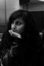
This is the draft for my contents page. I like it because it looks realistic and unique. I used the image on the front cover for this page and made it smaller to link it back and this makes it look like they are both of the same magazine. It also shows that is a special feature in the magazine, as it is 8 pages. Although my magazine is a music magazine, many music magazines have a fashion section, and according to my research my target audience enjoy reading magazines that do as such, such as RWD. I decided to write an editor's letter because this is featured in some contents pages, and they are always interesting to read because readers are rarely aware of who the editor of the magazine is and what they're like. I also used the same font for the title as the title on my front cover, and the same font for the features on the front cover and the editor's letter and list of content on my contents page. This is necessary because if I used different fonts for everything, it would look unusual and not realistic. I used red, blue and white for the same reasons I did for the front cover. The list of content is horizontal because according to my research magazines that have their list of content horizontally look better because this is not the case with all magazines. However, I may decide to change this for my final contents page. I have a page number at the bottom with the magazines name so that readers can refer back to the page and know what magazine they are reading throughout.

Subscribe to:
Post Comments (Atom)
No comments:
Post a Comment