
Saturday, 20 March 2010
Interview Page - Draft
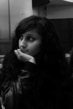
This is the draft for my interview page. I decided to use two images to make the double-page spread look more interesting to look at, and to also show two different sides of the featured artist. The colour scheme of this page is not the same as the front cover or contents page. I did this because I thought if I made the background black and used the same font colours and everything else it would look too boring and repetitive, which I don't want. Many magazines do this. I used the same font for the actual interview but a different one for the title. I did this to reflect the featured artists appearance, which is quite 'girly'. I thought this would be appropiate as I am targetting girls. I used black for the writing because it stands out against white very well, and turqoise because it matches the model/featured artist's top and compliments the black writing. I used purple for the title to compliment the turqoise, and I think it does a good job of it. I used the same red font for the page number and magazine name at the bottom because that should always be consistent throughout a magazine. I used a funny caption for the second image to appeal to my target audience. Overall, I am pleased with the outcome of this. However, I will make further edits to it to improve it.

Subscribe to:
Post Comments (Atom)
No comments:
Post a Comment