Thursday 29 April 2010

Evaluation

This is my evaluation for my Media AS Coursework. As you can see, it doesn't look too creative however I did try my best and I explained everything I needed to when presenting. I spoke about all the choices I made and explained them. I didn't put up every piece of information one each slide because I felt it would look too squashed together, cluttered or overall just too much writing to read. So I only put up a little bit, but talked about it a lot. One thing I included which we weren't asked to was how I would promote my magazine, and I spoke about different methods of marketing such as viral marketing and SMO (social media optimization) marketing. If I was to do it again, I would make my presentation look better and refer to my preliminary task a bit more, maybe add more content to fill in blank spaces and include my own reader profile.

Friday 26 March 2010

Picture For Contents Page - Final

I decided to adjust the lighting of the image by brightening/darkening it. I am please with the way it looks and I think it is something that would be featured within a music magazine. The picture illustrates summer a bit more and because it's for my fashion spread, it shows that there are two different sides.

Thursday 25 March 2010

Picture For Contents Page

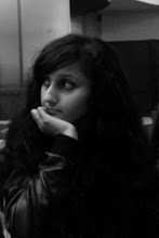
I decided to take a picture for my contents which would reflect the Summer and also be for the 'styles and trends' page. This sort of spread is featured in most music magazines. My model is looking to her left and the sun is shining on her left, leaving the rest of her dark, which creates a good effect. I saturated the image, and made the shaddowed side darker and the light side brighter. It may need further edits, but overall I am happy with the way it looks.

Saturday 20 March 2010

Another Edit Of My Second Interview Picture

After doing my draft contents page, I realised that although the second image was edited, it still looked quite plain. But, if too much was done to it, it would look tacky. So I decided to add a black outline and a few splodges to make the image look contemporary and overall interesting to look at. I also altered the saturation of the image. Instead of writing the caption in the bottom right corner, I decided to place a speech bubble in the right corner with the caption, which makes it stand out more and look quite humourous. The speech bubble is purple to go with the title, so it doesn't look like it is the only purple thing on the page. I am pleased with this edit because it images the model/featured artists age and personality. I will use this for my final interview page.