Saturday, 20 March 2010
Interview Page - Draft
This is the draft for my interview page. I decided to use two images to make the double-page spread look more interesting to look at, and to also show two different sides of the featured artist. The colour scheme of this page is not the same as the front cover or contents page. I did this because I thought if I made the background black and used the same font colours and everything else it would look too boring and repetitive, which I don't want. Many magazines do this. I used the same font for the actual interview but a different one for the title. I did this to reflect the featured artists appearance, which is quite 'girly'. I thought this would be appropiate as I am targetting girls. I used black for the writing because it stands out against white very well, and turqoise because it matches the model/featured artist's top and compliments the black writing. I used purple for the title to compliment the turqoise, and I think it does a good job of it. I used the same red font for the page number and magazine name at the bottom because that should always be consistent throughout a magazine. I used a funny caption for the second image to appeal to my target audience. Overall, I am pleased with the outcome of this. However, I will make further edits to it to improve it.


Contents Page - Draft
This is the draft for my contents page. I like it because it looks realistic and unique. I used the image on the front cover for this page and made it smaller to link it back and this makes it look like they are both of the same magazine. It also shows that is a special feature in the magazine, as it is 8 pages. Although my magazine is a music magazine, many music magazines have a fashion section, and according to my research my target audience enjoy reading magazines that do as such, such as RWD. I decided to write an editor's letter because this is featured in some contents pages, and they are always interesting to read because readers are rarely aware of who the editor of the magazine is and what they're like. I also used the same font for the title as the title on my front cover, and the same font for the features on the front cover and the editor's letter and list of content on my contents page. This is necessary because if I used different fonts for everything, it would look unusual and not realistic. I used red, blue and white for the same reasons I did for the front cover. The list of content is horizontal because according to my research magazines that have their list of content horizontally look better because this is not the case with all magazines. However, I may decide to change this for my final contents page. I have a page number at the bottom with the magazines name so that readers can refer back to the page and know what magazine they are reading throughout.


Front Cover - Draft
This is the draft of my front cover, which I am quite happy with. I used magazines such as bold/large title, issue date, price, barcode, features, a competition, catchy headlines and a main image. If I didn't use these conventions, the front cover wouldn't look like a front cover. I decided to use a red title because red stands out from black, and I used white writing for the features because it contrasts black and compliments red. I used blue for the two numbers and banner at the top to compliment the red title and the names of artists also in red. The features on the right are right justified so that they are facing the middle which makes the model on the page stand out, and it also looks quite neat. I like the cover because it looks like how most magazine covers do, however I may make further edits to it to make it more realistic.


Friday, 19 March 2010
Second Interview Picture - Edited
Not much has been done to the image, except for cropping it to remove the excess bricks in the background. Now, the model doesn't look so small and she is the main focus of the image. The bricks give the image a natural feel, and make it look as if the featured artist hasn't quite launched her career so it isn't taken in a state-of-the-art studio.


Second Interview Picture
I took this picture to allow my target audience get a slender insight of the featured artist's personality. Her grin looks quite cheeky, and looking in the opposite direction makes her look as if she has done something naughty - like a child. Her somewhat shrug in her pose emphasises this. I edited the picture and made it brighter, and made her hair look slightly burgundy to compliment her top. I am satisfied with this image, however attention is immediately drawn to the bricks in the background, and they make the model look small.


First Interview Picture - Edited
This image doesn't look too different to the other one, but I decided to alter the colours slightly because my front cover shot is predominantly black, so I didn't want this to be black too. I decided to lighten the image, so the black and white effect looks like a dark shade of brown, which looks intriguing because the iris and sclera in both of her eyes stand out more and it emphasises on the point I made in the previous post about the model/featured artist.


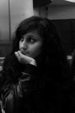
First Interview Picture
I took a picture for my interview page using another model. Because the artist is up and coming, I decided to use a close up shot of her face to show my target audience that she is new and her face may need familiarising with. I used a black and white effect to take the image. This gives the model/featured artist an old fashioned look, because her music is contemporary but includes soulful elements to give it a classic feel. I thought it would be important to convey this through the image taken. I made sure that the model's hair looked big to match her voice, and that her make up stood out but not too much because this could look a bit daunting. I was inspired to create this type of look by researching images of Amy Winehouse, even though her music is quite jazzy.


Subscribe to:
Posts (Atom)